You know how every season of Project Runway they've had some sort of inspiration challenge wherein all the contestants are given cameras (which is obviously shameless product placement as the brand of said camera is usually in full view through the whole episode and each contestant is sure to mention the brand name every time they talk) then are told to run around New York City taking pictures, one of which must become the inspiration for a garment they are to produce? (If not, you do now.) Well, after I received an iPhone for my birthday last September, I thought I would try a PR inspiration challenge of my own. Most of my design and knitting decisions have been based simply on what happens to strike my fancy that week (at Anthropologie), what I feel like wearing, what hole in my closet I need to fill, or what fun things I can do with a certain yarn I've had sitting around for awhile. I've rarely thought too deeply about what to knit and why; I've just let it come naturally. That said, I was curious to see what sorts of things in the world were actually aesthetically speaking to me and if they had any correlation to what I had been knitting or designing. So for several months now, I've been taking random iPhone snapshots of views and buildings and things -- I haven't been putting any thought into these snapshots, I just point and shoot anything that I
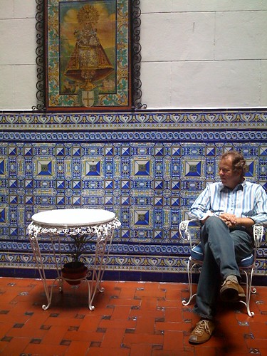
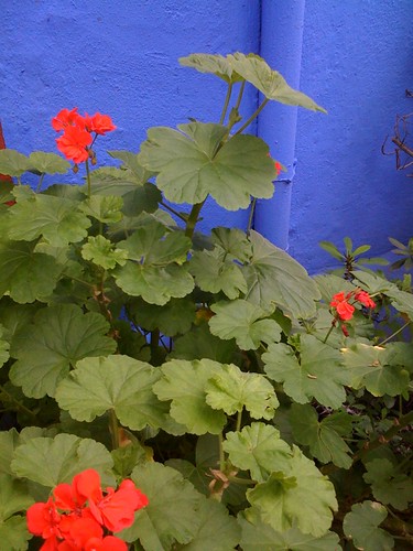
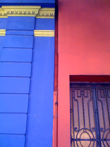
like, for whatever reason. Below is a selection of these snapshots that represent a few themes I found when going through the photos recently. What I noticed is that I focused on colors rather than shapes and some surprised me a little...
.jpg)
.jpg)
.jpg)
.jpg)
.jpg)
.jpg)
.jpg)
.jpg)
.jpg)
Red and blue? Orange and green?! Never in my life have I knit or worn these color combinations (save for a few 4th of July outfits), but I am apparently obsessed with them. The color against grey and the black, white, color, and grey were expected, but I'm not sure where the orange and green thing came from. Secret passion for Irish politics?
This was a fun exercise, and I'm going to keep doing it, not least because I have a whole record of places I've been (including my own neighborhood) on my telephone. And maybe this is telling me that I should start being a little more adventurous with colors (other than bright green) when I'm knitting. Even if I don't wear it, at least I know I'll enjoy the process!


.jpg)
.jpg)
.jpg)
.jpg)
.jpg)
.jpg)
.jpg)
.jpg)
.jpg)

9 comments:
That sounds like a fantastic creative process! (I sigh a little because for some reason, only the first few pics d/l on my comp.)
Depend upon my revisiting to see all the pics again :)
And, as an aside, I'm a big fan of many colours, but find that there are those ones that I'd rather surround myself with, and then there's those ones I'd rather wear. Ne'er do those two meet.
The last nine pictures aren't loading for me either, unfortunately. Different eyes, different focus: tt's the shapes and textures in the pictures I can see that attract me. Like the patterns on the wall in the first one and the wrought-iron shapes in the third one. Lovely :)
Darn it, I can only see the first 3 photos. I'll have to try again later. Sounds fun though. And funny you should mention green and orange - I was just contemplating those colors in a pair of mittens.
yes, me too with the first three pictures, but i love the ones i can see. i am always crazy about primary colors this time if year. I feel like i always knit with brown, taupe, or green. sometimes i get a color in there, but not very often.
don't forget, i have seen a few purple things from you too! see, you are daring with color!
Woohoo, I can see them all now! What a great assemblage of photos! The colours really stir up energy! Great idea, Hilary! I'm looking forward to seeing any knits that may come of this...
Thanks, folks, for the comments! And sorry for the photo mishap -- I was careless in my posting today and had linked the pictures from an inaccessible place! They're fixed now.
I'd love to know why we are drawn to certain colors; the science behind the chemical reactions that occur in our brains to produce feelings when we see them. T, you're right -- some colors are for looking at, some are for wearing. I love looking at orange, but it goes horribly with my skin tone (unlike you, who look stunning in that color!). Crudmonkey - thanks! I'm actually a little in love with the tile on the wall of that room in the 1st one. But I hadn't really noticed the shapes on the door in the 3rd! Lady - what a coincidence! And I'm really dying to see your *blue* and orange combo. Philigry, you've had a purple, too! :)
I'm not familiar with that program but it sounds like a fun one. Love your photos and a glimpse into life in SF!
Looking forward to seeing how these colors and/or shapes influence your knitting.
Oh yay, I can see them now, I'm glad you were able to fix them. Looks like you've been hanging around Mexican eateries lately.
I was going to agree with Canary Sanctuary - what we like to see and what we like to wear are not always the same things.
those photos are gorgeous!! I love that they focus on the colours, and such vibrant ones at that.
- Julie
Post a Comment